How to Style a Bookshelf: Shelf-by-Shelf Ideas You Can Preview With AI
A practical guide to styling a bookshelf so it looks collected rather than cluttered: the 60/40 balance of books and objects, the rule of three, color grouping, negative space, lighting, small-space shelves, and how to preview a new arrangement on a photo of your own room with AI.
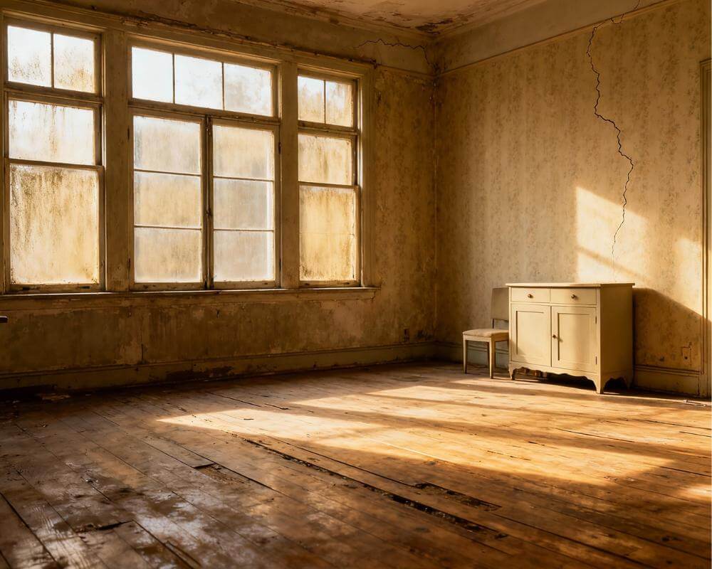
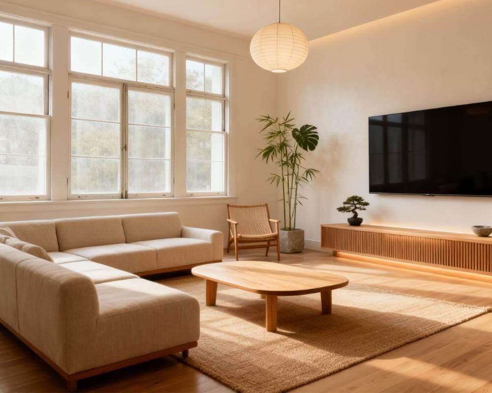
Learning how to style a bookshelf is really about one tension: you want a shelf that holds real life, yet looks composed. DecorAI is an AI interior design app that lets users transform photos of existing rooms into realistic redesign concepts. That makes it a handy way to test a new shelf arrangement, wall color or piece of furniture on your own room before you move a single book.
A well-styled bookshelf mixes books with objects, leaves deliberate gaps and repeats a small palette so the eye has somewhere to rest. This guide walks through the decisions in the order that matters: how to prepare the shelf, how to balance books and objects, how to arrange each shelf, and how to keep the result looking good when you actually use it.
Key Takeaways
- Edit first. Take everything off the shelf and put back only what you love or use.
- Balance books and objects. A rough 60/40 split of books to decorative pieces keeps a shelf useful and still styled.
- Work in threes. Groups of three objects at different heights look intentional.
- Leave negative space. Empty areas are what make the filled areas look deliberate.
- Repeat a palette. Two or three recurring colors or materials tie the whole unit together.
- Preview before you rearrange. AI lets you test shelf colors and layouts on a photo of your real room.
- Try DecorAI free to see a bookshelf wall redesigned from a single photo.
Where Should I Start When Styling a Bookshelf?
Start by emptying it. It is tempting to move things around in place, but a clean shelf shows you what you actually own and how much room you have to work with. Wipe the shelves, then sort everything into three piles: keep on display, keep but store elsewhere, and let go.
- Look at the unit itself. Note the shelf depth, the spacing between shelves and whether the back panel is plain or open.
- Decide the job. A shelf in a home office needs to be mostly functional, while one in a living room can lean decorative.
- Gather your candidates. Collect books, vases, frames, baskets, candles, plants and small sculptures in one place before you place anything.
If the shelf is part of a reading corner or study, our guide to AI home library design covers the whole room around it.
How Many Books and How Many Objects?
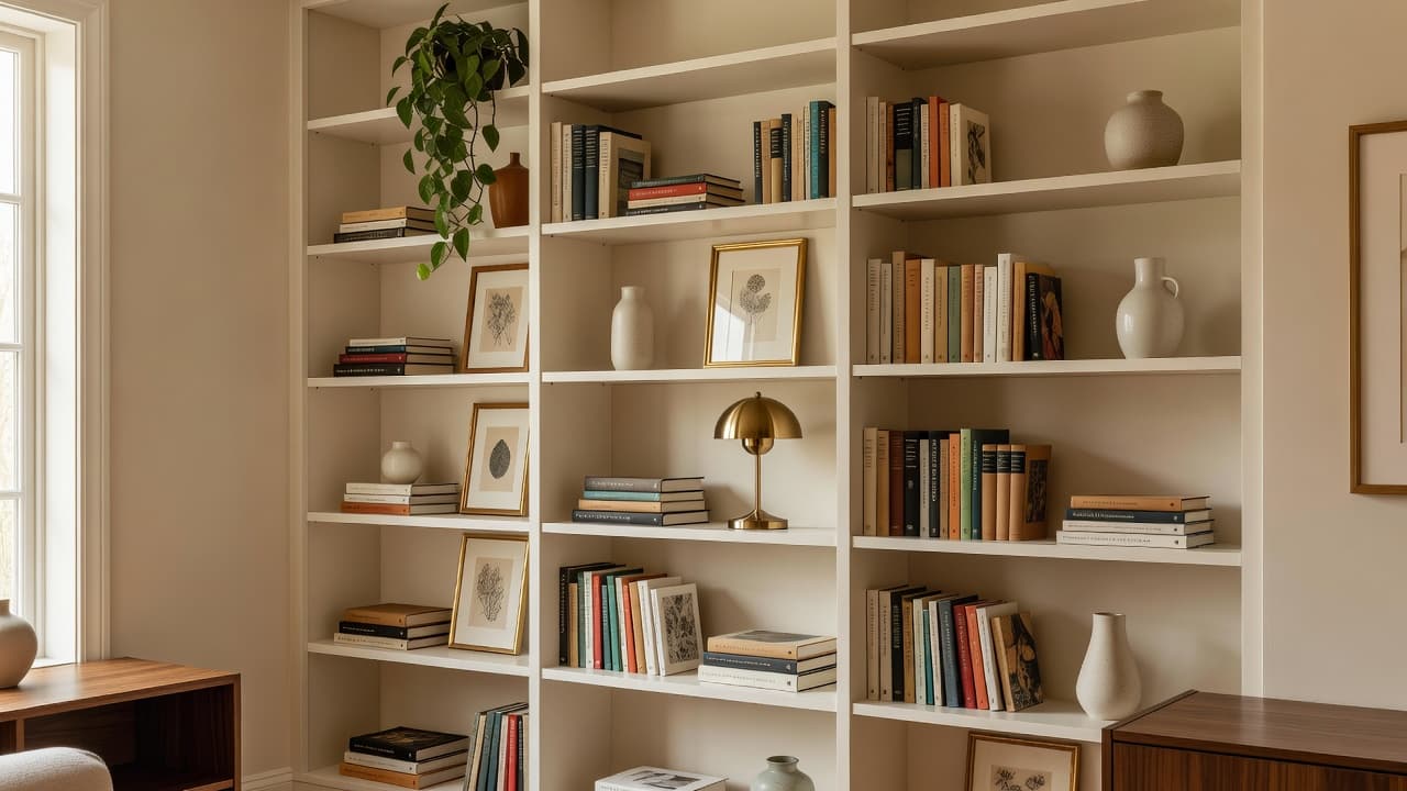
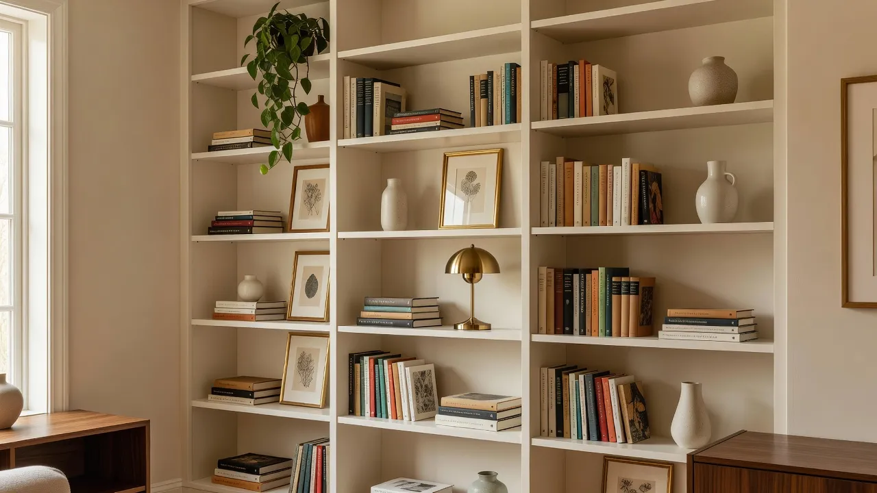
A common designer rule of thumb is to fill roughly 60 percent of a bookcase with books and about 40 percent with objects, and to leave the rest as air. It is a guide rather than a law, but it stops a shelf from becoming either a wall of spines or a display case with nothing to read.
Mix the orientation
Alternate between upright runs of books and horizontal stacks. A short stack of two or three books also works as a plinth: set a small bowl, candle or sculpture on top to add height without buying anything new.
Vary the scale
Put taller items toward the ends or the back of a shelf and shorter ones in front. A shelf where every object is the same height looks flat, while a gentle zigzag in height feels natural.
Use the shelf edge
Lean a framed print against the back and let a lower object overlap its corner. Layering like this adds depth that a single row of objects cannot.
What Is the Rule of Three for Shelves?
Odd numbers look more natural than pairs, and three is the easiest. For each shelf, build one or two small groupings of three: for example a stack of books, a vase and a framed print, chosen so they differ in height, texture and shape. Then leave a gap before the next group begins.
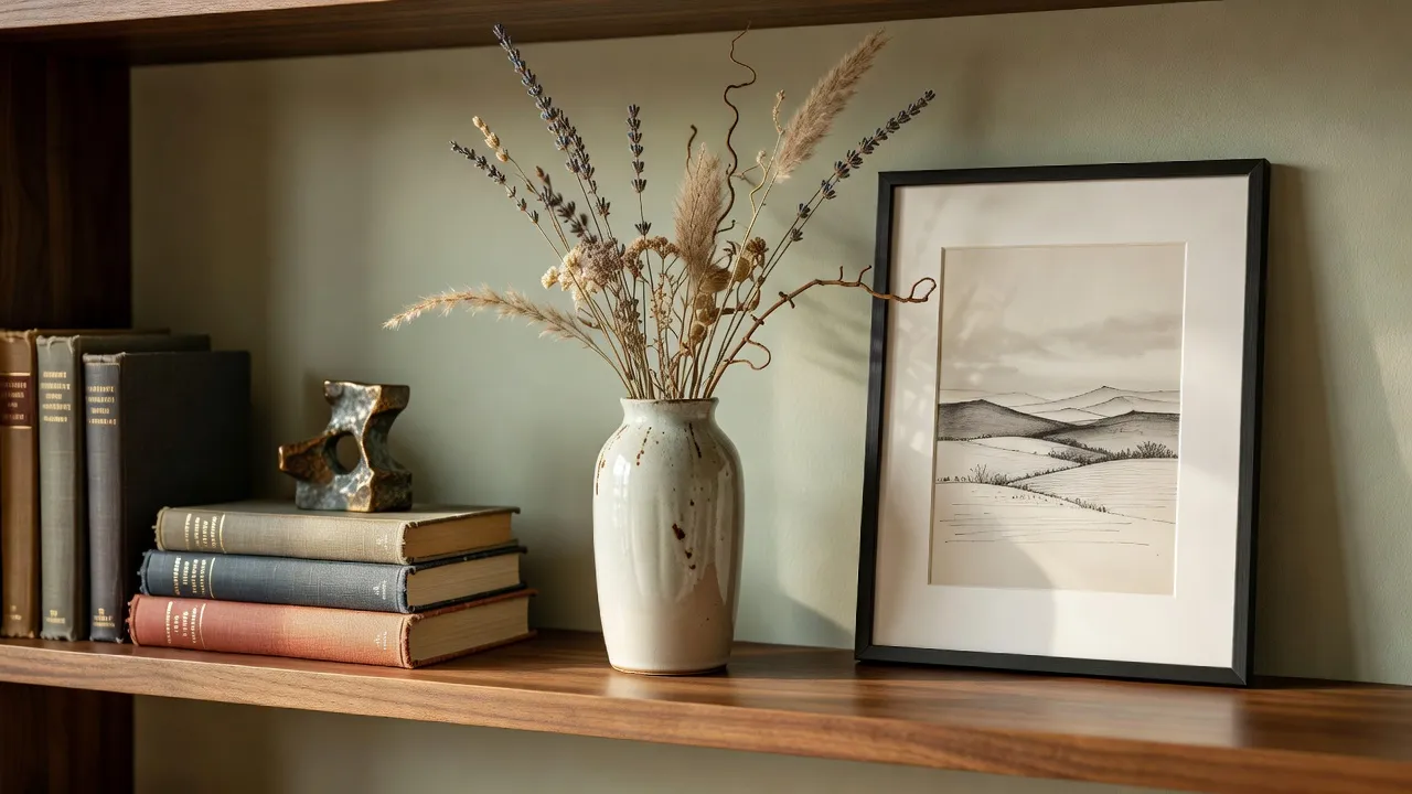
- One tall, one medium, one low. A vase with stems, a stack of books and a small bowl is a reliable combination.
- One natural element. A plant, dried stems, wood or stone softens harder objects.
- One personal piece. A photo, a souvenir or a handmade ceramic stops the shelf from looking like a showroom.
Should I Arrange Books by Color?
Color grouping is a style choice, not a requirement. Sorting books into a gradient, or turning spines inward so only pale page edges show, creates a calm, uniform look that photographs well, but it makes finding a particular title slower. If you read from your shelves, a middle path works well: keep your library by subject or author, and let the objects carry the color story.
- Pick a limited palette. Two or three recurring tones, such as cream, walnut and sage, hold a busy shelf together.
- Repeat colors across shelves. A green vase on the top shelf and a green book run lower down creates rhythm.
- Paint the back panel. A deeper color behind the shelves makes objects stand out and the whole unit feel built in. Our guide to interior design color schemes explains how to choose one.
How Much Empty Space Should I Leave?
More than most people expect. Negative space is what lets each grouping read as a choice. Aim to leave a few spots on every shelf with nothing on them, and consider leaving one or two compartments in the unit nearly bare. If a shelf feels busy and you cannot tell why, remove a third of what is on it and look again.
See Your Bookshelf Wall Redesigned — Free
Upload one photo of your room and watch DecorAI restyle your actual space in seconds, keeping your real walls, windows and layout. Try a new back-panel color, a different shelving unit or a new reading chair before you rearrange anything.


Can Lighting Improve a Bookshelf?
Yes, and it is one of the cheapest upgrades. A shelf in a dim corner reads as a dark block, while a little warm light makes the objects glow.
- A small table lamp on a shelf or a nearby surface adds a warm pool of light.
- Adhesive LED strips under a shelf edge light the shelf below without drilling.
- A picture light or nearby sconce highlights a framed print.
For more on layering fixtures and choosing bulb color, see our AI lighting design guide.
How Do I Style a Bookshelf in a Small Space?
In a small room, a slim or ladder-style unit keeps the floor visible and the room feeling open. Keep the palette quiet, use baskets to hide odds and ends, and let one plant or lamp do the decorating.
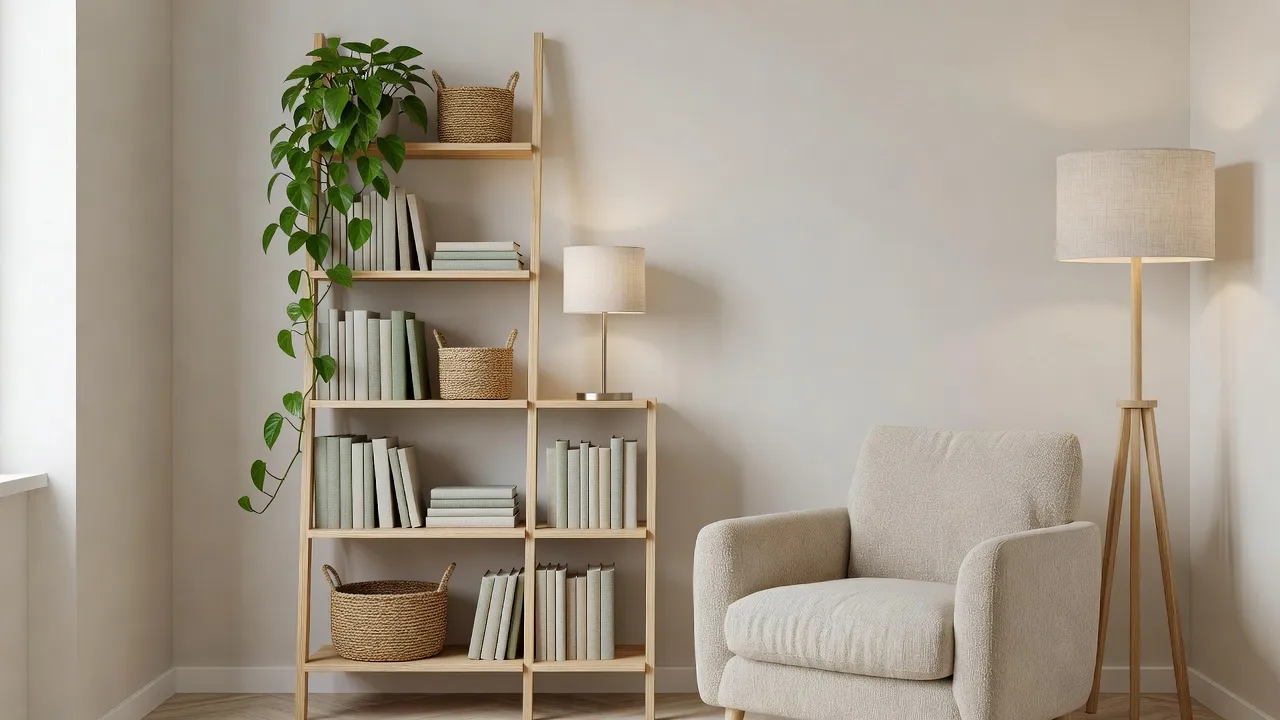
- Go vertical. Use height rather than width, and keep the heaviest items on the lowest shelves.
- Use baskets and boxes for remotes, chargers and paperwork so the open shelves stay calm.
- Keep the palette tight. Fewer colors make a small shelf feel larger.
Our guide to AI interior design for small spaces has more ideas for compact rooms.
How Do I Preview a Bookshelf Makeover With AI?
Shelf color, unit style and the furniture beside it are easy to imagine and hard to judge. A photo-based preview takes a few minutes and helps you decide before you buy paint or a new bookcase.
- Photograph the wall straight on, in good light, with the whole unit and some floor visible. Our guide to photographing your room for AI design has framing tips.
- Upload it to DecorAI and choose a style from the 60+ designer styles, such as Scandinavian, Mid-Century Modern or Japandi.
- Compare options: try a deep green back panel against warm white, or a built-in against a freestanding unit.
- Refine the details with the AI inpainting editor, for example to change a lamp or add a plant.
- Test in real life: arrange a single shelf using the rules above before you restyle the whole unit.
AI previews are for planning. Real finishes and proportions will look different in your room, so measure carefully and test paint samples before you buy.
What Mistakes Make a Bookshelf Look Worse?
- Filling every inch. Without gaps, nothing stands out.
- Lining objects up in a row. Vary the height and depth instead.
- Too many tiny items. A few larger pieces read better than many small ones.
- Ignoring weight. Heavy books belong on the lower shelves, especially on a tall unit.
- Styling once and never editing. A shelf that is used needs a quick tidy now and then.
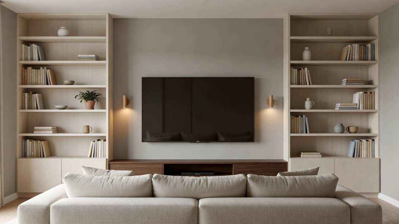
If the shelf sits beside a television, our guide to how to decorate a TV wall shows how to combine shelving with a screen.
Bookshelf Styling FAQ
How do I make a bookshelf look good without many books?
Use baskets, framed prints, a plant, a lamp and a few ceramics, and group them in threes with plenty of space around them. A shelf with fewer items often looks more deliberate than a full one.
Should books be vertical or horizontal?
Both. Upright runs hold the shelf together, while horizontal stacks add variety and double as plinths for small objects.
What color should I paint the back of a bookshelf?
A deeper tone such as sage, navy or warm taupe makes objects stand out, while a pale shade keeps the unit light. Preview a few options on a photo of your room first.
How do I stop a styled bookshelf looking cluttered?
Edit down, keep a limited palette and leave some surfaces empty. If you cannot tell why it feels busy, remove about a third of the items and look again.
Can AI show me how my bookshelf wall could look?
Yes. Upload a photo of your room to DecorAI, pick a style, and the AI redesigns your real space photorealistically, so you can compare colors and furniture before you spend anything.
Conclusion
The best way to style a bookshelf is to edit hard, balance books with a few objects, work in threes and leave room to breathe. Add one warm light, repeat a small palette and keep what you use within reach. Then test the bigger decisions, like back-panel color and the unit itself, before you commit. Upload a photo to DecorAI and compare a few options on your own room. You can also explore our AI living room design ideas for more inspiration.
Visualize Your Dream Home Instantly
Don't just read about it. Experience the power of AI interior design with DecorAI's free tool.
Start Designing for FreeWritten by
DecorAI Team
Editorial Team