Interior Design Color Schemes with AI: How to Find Your Perfect Palette in 2025
Master interior design color schemes using AI tools. Learn color theory basics, discover trending palettes for 2025, and use AI to visualize paint colors before you commit. Complete guide to AI color matching.
Color is the most powerful—and most intimidating—element of interior design. The right palette transforms a room from forgettable to magazine-worthy. The wrong one? Years of regret every time you walk through the door. This is exactly why AI color palette interior design tools have become essential for homeowners and designers alike.
Gone are the days of holding tiny paint swatches against walls and hoping for the best. With AI color scheme generators, you can visualize exactly how any color will look in YOUR space, under YOUR lighting, before opening a single paint can. This comprehensive guide shows you how to master color using AI—from basic theory to trending 2025 palettes.
Why Color Choice Makes or Breaks a Room
Color affects everything: how large a room feels, how warm or cool the atmosphere, even your mood and energy levels. According to research from the American Psychological Association, color can significantly impact psychological functioning, including mood, attention, and decision-making.
Yet color is where most homeowners freeze. The stakes feel high:
- Paint is relatively inexpensive but time-consuming to redo
- Furniture purchases around the wrong wall color become costly mistakes
- Small paint samples never look the same when scaled to full walls
- Lighting changes everything—and varies throughout the day
This is precisely why AI color matching home decor tools are revolutionizing how we choose color. See it before you commit. Test unlimited options. Make confident decisions.
Color Theory Basics for Interior Design
Before diving into AI color scheme generators, understanding basic color theory helps you make better choices—and communicate what you want to the AI.
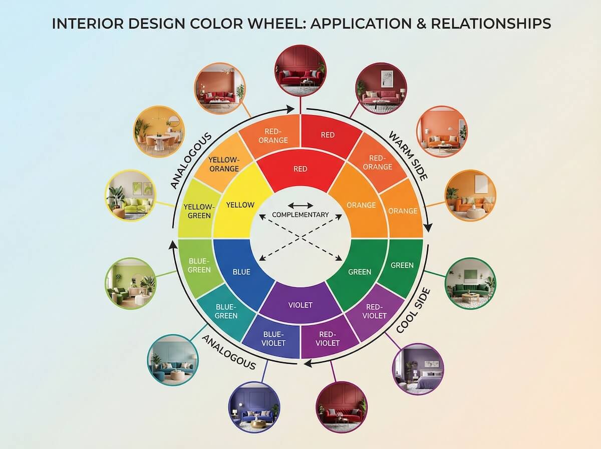
The Color Wheel
All color relationships stem from the color wheel:
- Primary Colors: Red, yellow, blue—the foundation
- Secondary Colors: Green, orange, purple—mixing primaries
- Tertiary Colors: The six colors created by mixing primary and secondary
Key Color Schemes
These classic relationships create harmonious palettes:
| Scheme Type | Description | Best For |
|---|---|---|
| Monochromatic | Variations of one color (light to dark) | Calm, cohesive spaces; small rooms |
| Analogous | Colors next to each other on the wheel | Natural, harmonious flow |
| Complementary | Opposite colors on the wheel | Bold, energetic contrast |
| Triadic | Three colors equally spaced | Vibrant, balanced variety |
| Split-Complementary | One color plus two adjacent to its complement | Dynamic but easier than complementary |
Warm vs. Cool Colors
Understanding temperature helps create the right mood:
- Warm Colors (reds, oranges, yellows): Energizing, cozy, advancing (make rooms feel smaller)
- Cool Colors (blues, greens, purples): Calming, refreshing, receding (make rooms feel larger)
- Neutrals: The backbone that lets accent colors shine
How AI Color Tools Transform Color Selection
AI paint color visualizer tools use advanced computer vision to revolutionize how we choose and test colors:
Photo-Realistic Visualization
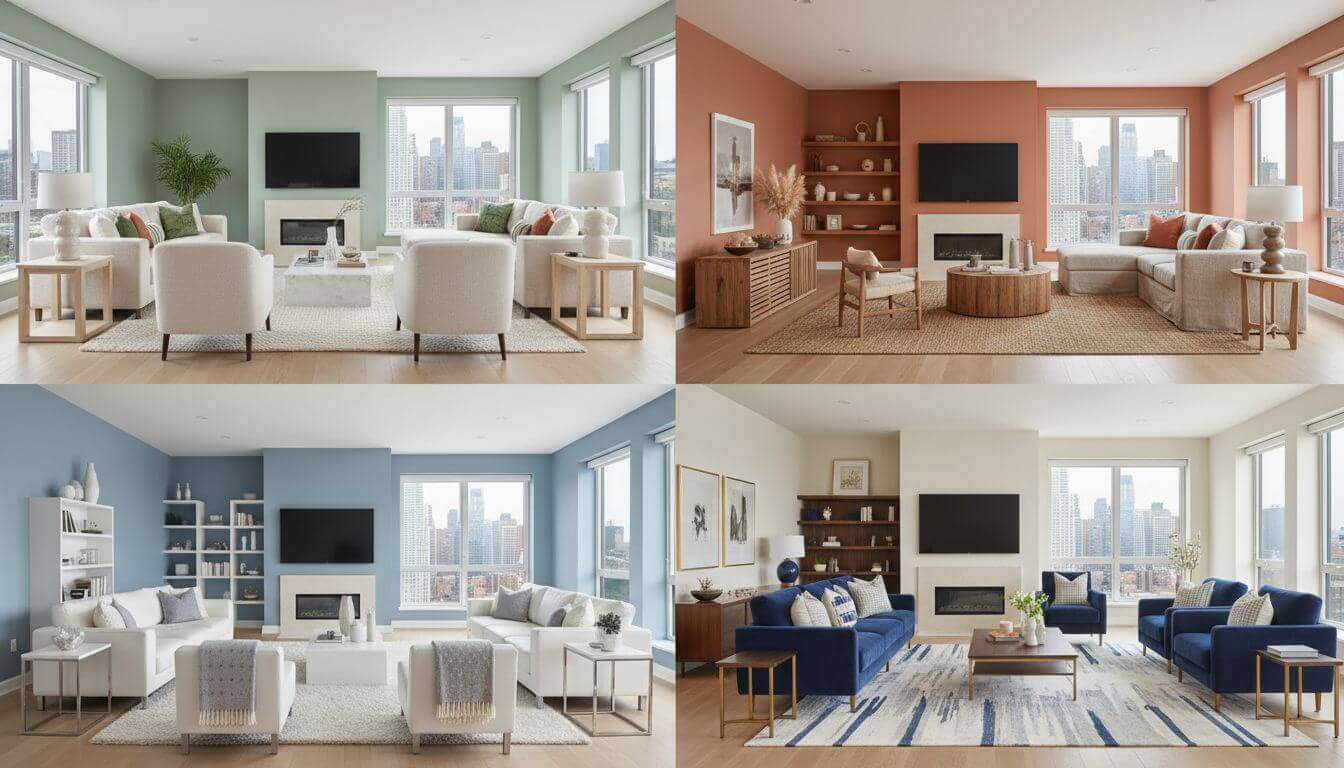
Upload a photo of your room, select any color, and see it rendered on your actual walls with proper lighting and shadows. Unlike flat digital mockups, AI color palette interior design tools understand how light plays across surfaces.
Intelligent Color Extraction
See a color you love in a photo? AI can extract the exact hex code and suggest complementary colors for a complete palette. Found the perfect green in a nature photo? Apply it to your living room in seconds.
Lighting Simulation
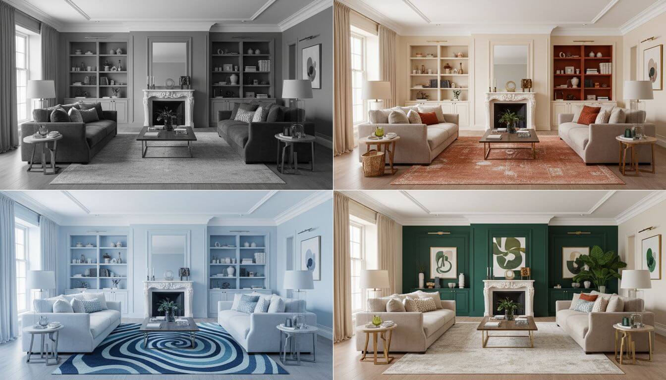
Advanced AI color scheme generators show how colors change throughout the day—morning light, afternoon sun, evening lamplight. That perfect gray might look blue in your north-facing room.
Style-Based Suggestions
Tell the AI you want "Scandinavian" or "Mediterranean" and receive curated color palettes that match the style. No more guessing which colors define a design aesthetic.
Trending Color Palettes for 2025
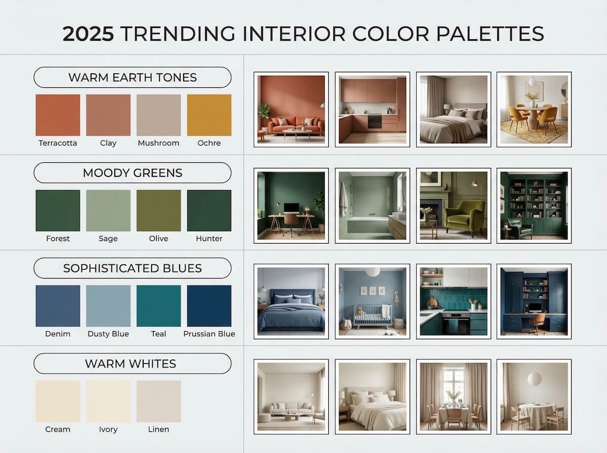
Based on data from millions of AI-generated designs and industry forecasts, these are the interior design colors dominating 2025:
1. Warm Earth Tones
The post-pandemic shift toward nature-inspired spaces continues. Look for:
- Terracotta: Rich, grounded, Mediterranean warmth
- Clay: Softer than terracotta, incredibly versatile
- Mushroom: The new "greige"—warm gray with brown undertones
- Ochre: Earthy yellow that adds energy without overwhelming
2. Moody Greens
Green continues its reign as the "new neutral":
- Forest Green: Deep, sophisticated, perfect for accent walls
- Sage: Soft, calming, works in any room
- Olive: Warmer green that pairs beautifully with wood tones
- Hunter Green: Classic, timeless, gaining kitchen popularity
3. Sophisticated Blues
Moving beyond navy to more complex blues:
- Denim Blue: Casual, comfortable, universally appealing
- Dusty Blue: Soft, serene, perfect for bedrooms
- Teal: The bridge between blue and green—vibrant yet grounded
- Prussian Blue: Deep, dramatic, incredibly elegant
4. Warm Whites & Off-Whites
Stark white is out. Warm, creamy whites are in:
- Cream: The quintessential warm white
- Ivory: Slightly more yellow, very cozy
- Linen: Gray-beige undertones, sophisticated
- Swiss Coffee: The interior designer's favorite warm white
5. Bold Accent Colors
For those ready to make a statement:
- Burgundy: Rich, luxurious, unexpected
- Burnt Orange: Energetic but sophisticated
- Chartreuse: For the bold—electric yellow-green
- Plum: Deep purple making a major comeback
Room-by-Room Color Guide
Different rooms serve different purposes—and their colors should support those functions. Use AI color matching home decor to test these recommendations in your actual spaces.
Living Room Colors
Living rooms need to balance energy for entertaining with comfort for relaxing:
- Recommended: Warm neutrals, soft blues, sage green, warm grays
- Accent opportunities: One bold wall, colorful artwork, statement furniture
- Avoid: Overly stimulating colors on all walls; they tire the eye
For layout ideas, see our AI living room design guide.
Bedroom Colors
Bedrooms should promote rest and relaxation:
- Recommended: Cool blues, soft greens, lavender, warm whites, blush pink
- Psychological impact: Blue lowers blood pressure; green reduces anxiety
- Avoid: Bright reds, oranges, or any stimulating colors on walls
Explore more in our AI bedroom design guide.
Kitchen Colors
Kitchens benefit from energizing colors that also photograph well:
- Cabinet colors trending: White, navy, sage green, warm gray, black
- Wall colors: Light and bright to maximize workspace visibility
- Accent colors: Through backsplash, hardware, and accessories
For renovation ideas, see our AI kitchen remodel guide.
Bathroom Colors
Bathrooms can handle bolder choices due to their smaller size:
- Spa-like: Soft greens, cool blues, warm whites
- Bold statement: Deep navy, forest green, even black
- Consider: Tile color is permanent—walls are easier to change
More inspiration in our AI bathroom design guide.
Home Office Colors
Colors that promote focus and productivity:
- Best for focus: Green (reduces eye fatigue), blue (promotes concentration)
- Energizing: Yellow accents boost creativity and optimism
- Avoid: All-white (sterile, institutional) or dark walls (can feel oppressive)
Step-by-Step: Using AI to Find Your Perfect Colors
Here's the optimal workflow for using AI paint color visualizer tools:
Step 1: Document Your Fixed Elements
Before choosing wall colors, identify what CAN'T change:
- Flooring color and undertones
- Kitchen countertops and cabinets
- Bathroom tile
- Large furniture pieces you're keeping
- Architectural features (brick, stone, wood trim)
Step 2: Photograph Your Space
For accurate AI color scheme generator results:
- Shoot during daylight AND evening (lighting changes everything)
- Include windows in the shot to capture light quality
- Photograph from multiple angles
- Keep the current wall color visible for reference
Step 3: Start with Inspiration
Find colors you love in:
- Nature photos
- Artwork you own
- Fabric or textile you love
- A favorite piece of clothing
- Design magazine images
Upload these to your AI tool and extract the color palette.
Step 4: Generate and Compare
Use DecorAI or similar AI color palette interior design tools to:
- Apply your inspiration colors to your room photos
- Generate variations (lighter, darker, warmer, cooler)
- Test 10-20 options before narrowing down
- View the same color in different rooms for whole-home flow
Step 5: Test in Real Life
Once AI narrows your choices:
- Order 2-3 sample pots of your top picks
- Paint large swatches (at least 12x12 inches) on different walls
- Live with them for 3-5 days, observing at different times
- Make your final decision with confidence

7 Color Mistakes AI Helps You Avoid
1. Ignoring Undertones
That "gray" paint has blue, green, or purple undertones that clash with your warm wood floors. AI color matching reveals undertone conflicts before you paint.
2. Trusting Tiny Swatches
A 2-inch swatch can't show how color behaves at scale. Colors intensify on large surfaces—what looks soft on a chip can overwhelm a room. AI shows true scale.
3. Forgetting the Ceiling
White ceilings aren't always right. AI interior design color tools can show you how ceiling color affects the whole room—sometimes matching walls creates elegance.
4. Ignoring Light Direction
North-facing rooms get cool light (blues appear more blue). South-facing rooms get warm light (colors appear warmer). AI simulates both conditions.
5. Too Many Colors
The 60-30-10 rule exists for a reason: 60% dominant color, 30% secondary, 10% accent. More than three main colors creates chaos. AI helps you visualize restraint.
6. Matching Instead of Coordinating
Your walls shouldn't match your sofa exactly—that's boring. Colors should coordinate and complement. AI color scheme generators suggest harmonious alternatives.
7. Following Trends Blindly
Just because hunter green is trending doesn't mean it works in YOUR home. AI lets you test trends in your actual space before committing.
Color Psychology for Every Room
Understanding how colors affect mood helps you make strategic choices:
| Color | Psychological Effect | Best Rooms |
|---|---|---|
| Blue | Calming, lowers blood pressure, promotes trust | Bedroom, bathroom, home office |
| Green | Balancing, reduces anxiety, connects to nature | Any room—the most versatile color |
| Yellow | Energizing, optimistic, stimulates creativity | Kitchen, entryway, home office (in moderation) |
| Red | Stimulating, passionate, increases appetite | Dining room accents, NOT bedrooms |
| Purple | Luxurious, creative, spiritual | Bedroom, creative spaces, powder rooms |
| Orange | Warm, social, enthusiastic | Living room accents, exercise spaces |
| White | Clean, spacious, fresh (can feel sterile) | Small spaces, modern aesthetics |
Creating Color Flow Throughout Your Home
A cohesive home doesn't mean every room is the same color. Here's how to create flow:
The 5-Color Maximum Rule
Limit your whole-home palette to five colors maximum:
- 1 white or off-white (ceilings, trim)
- 1 neutral (main walls in open areas)
- 2 accent colors (for individual rooms or features)
- 1 bold statement color (used sparingly)
Sightline Strategy
Use AI color palette interior design to check how colors look together from doorways. Rooms visible from each other should harmonize.
The Thread Theory
Run one "thread" color through every room—maybe it's your trim color, or a textile tone, or a metal finish. This creates subconscious cohesion.
Gradual Intensity
Start with lighter, neutral public spaces and allow more color intensity in private spaces. Entryway neutral → Living room warm → Bedroom colorful.
Special Color Considerations
Open Floor Plans
When rooms flow into each other:
- Use one wall color throughout the connected space
- Define zones with rugs, furniture, and accessories—not wall color
- Add color through a single accent wall visible from the main area
Small Spaces
For compact rooms:
- Light colors expand space visually
- Monochromatic schemes create flow
- OR: go bold—dark colors can feel cozy and cocoon-like
More strategies in our AI small space design guide.
Low Light Rooms
For rooms with minimal natural light:
- Avoid cool grays (they'll look dingy)
- Warm whites outperform stark white
- Consider embracing darkness—deep colors can look luxurious
Frequently Asked Questions
Can AI really match paint colors accurately?
Yes. Modern AI paint color visualizer tools render colors with remarkable accuracy, including how light affects appearance. While physical samples are still recommended before final purchase, AI narrows thousands of options to your top 2-3 choices with confidence.
How do I find the undertone in a paint color?
Compare your color to pure white under good lighting. The tint you see is the undertone—gray might show blue, purple, or green. AI color matching tools often identify undertones automatically and warn of potential clashes.
Should I paint all my walls the same color?
Not necessarily. Open concept spaces benefit from one consistent color, but separate rooms can have individual personalities. Use AI color scheme generators to visualize both approaches in your specific layout.
What's the best white paint for interiors?
There's no universal "best"—it depends on your lighting and undertones in the room. Popular options include Benjamin Moore's Simply White, Sherwin-Williams Alabaster, and Farrow & Ball's All White. Test with AI visualization first.
How many accent colors should I use?
The classic rule is 60-30-10: 60% dominant color (walls), 30% secondary (furniture, textiles), 10% accent (accessories, art). This typically means 2-3 colors beyond your neutral base.
Do dark colors make rooms feel smaller?
Not always. Dark colors can actually make walls "recede" and create a cozy, cocoon-like atmosphere. The key is proper lighting. Use AI interior design color tools to test dark colors in your specific room before deciding.
Conclusion
Color has the power to transform not just how your home looks, but how it feels. The right palette creates harmony, evokes emotion, and ties your entire space together. The wrong one creates years of regret.
AI color palette interior design tools have eliminated the guesswork. You no longer need to imagine how that sage green will look in your bedroom—you can see it. Test it in morning light and evening lamplight. Compare it against your existing furniture. Make decisions with confidence.
Whether you're choosing a single accent wall or planning a whole-home palette, AI visualization gives you the power to experiment freely, make mistakes virtually, and commit only when you're certain.
Your perfect color palette is waiting. AI helps you find it.
Ready to Discover Your Perfect Colors?
Visualize any color in your actual space before you commit. See how paint, furniture, and decor work together.
Try AI Color Visualization Free
See Your Perfect Colors
Before You Paint
Test thousands of colors in your actual room. See how light affects your choices. Design with confidence.
Visualize Your Dream Home Instantly
Don't just read about it. Experience the power of AI interior design with DecorAI's free tool.
Start Designing for FreeWritten by
DecorAI Team
Editorial Team