AI Gallery Wall Planner: Design Your Wall Art Layout Before You Hang Anything
A complete guide to using an AI gallery wall planner to preview frame layout, spacing, and arrangement on a photo of your actual wall before you hammer a single nail — grid versus salon-style layouts, spacing rules that actually work, matching frames to your room, and the most common gallery wall mistakes.
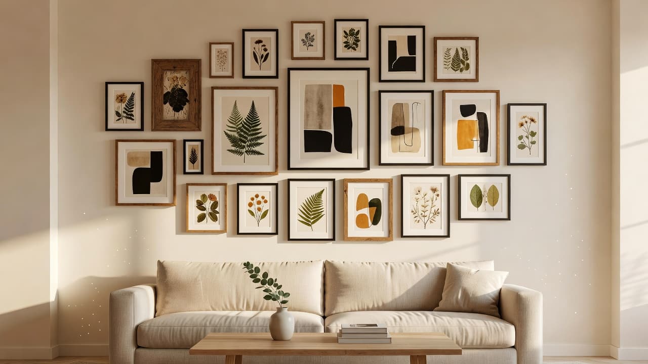
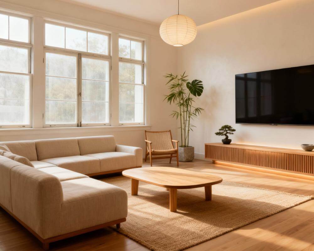
An AI gallery wall planner lets you upload a photo of your actual wall and preview a full frame arrangement — sizes, spacing, and layout style — rendered directly onto your real space, before you commit to a single nail hole, let alone a full grid of them. A gallery wall is one of the highest-payoff, lowest-cost changes you can make to a room, but it's also one of the easiest to get visibly wrong: uneven spacing, mismatched frame sizes, or a layout that looks cramped against a couch it was never measured for. With DecorAI, you can test a tight grid layout against a loose salon-style arrangement on the exact wall above your sofa, staircase, or hallway, and see how frame color and spacing actually read in your room's real light before you touch a hammer. This guide covers how AI gallery wall planning works, how to lay out a grid versus an eclectic salon-style wall step by step, the spacing rules that actually hold up in practice, matching frames to your room's style, and the most common gallery wall mistakes.
Key Takeaways
- Spacing consistency matters more than frame matching — a wall of mismatched frames with even 2 to 3 inch gaps reads as intentional; matched frames with uneven gaps read as a mistake.
- Paper templates are the traditional way to test a layout — an AI planner does the same job faster, directly on a photo of your real wall, without the tape and painter's paper.
- A grid layout is the safest choice for a first attempt — a salon-style or eclectic layout looks more personal but takes more planning to avoid feeling cluttered.
- Anchor the layout to a piece of furniture, not just the wall — a gallery wall centered on a sofa or console reads as designed; one centered on the wall alone often looks off relative to the furniture beneath it.
- AI lets you preview frame size, spacing, and color on your actual wall before drilling holes that are annoying and sometimes damaging to redo.
What Is an AI Gallery Wall Planner, and How Does It Work?
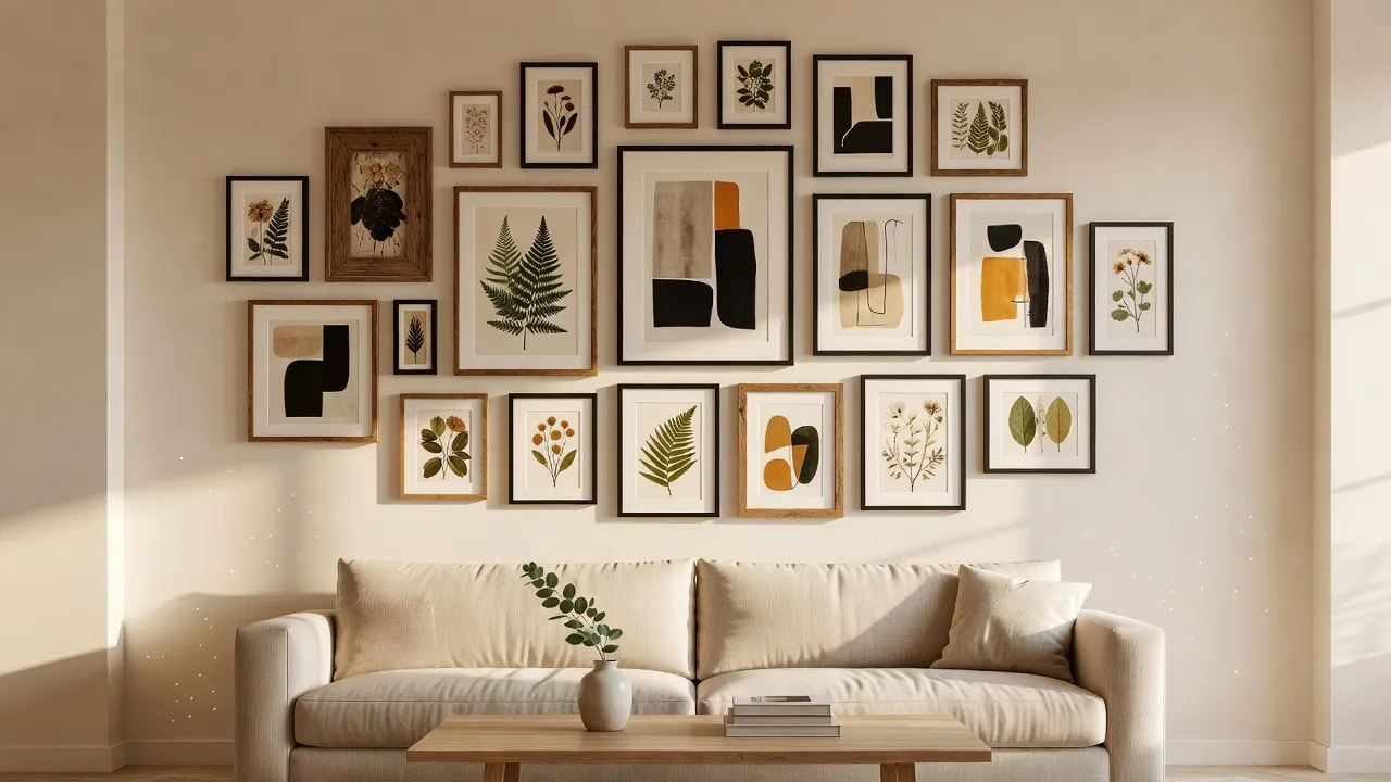
An AI gallery wall planner works from a photo of your actual wall — above a sofa, along a staircase, filling a hallway — and generates a photorealistic version of that same wall with a full frame arrangement applied at true scale: frame count, sizes, spacing, and finish, all positioned the way they'd actually hang given your wall's real dimensions and the furniture already in front of it. This matters because a gallery wall pulled from a design magazine or a template grid rarely accounts for your specific wall width, your ceiling height, or how your sofa's back cushions eat into the lower third of the layout — details that determine whether an arrangement will actually fit and feel balanced once it's up, rather than looking like it was designed for someone else's room.
How Do You Plan a Gallery Wall Layout Step by Step?
Planning a gallery wall well comes down to choosing a layout style, sizing it to your wall and furniture, and testing the arrangement before any frame goes on the wall.
Grid Layout: The Safest Starting Point
A grid layout uses identical or near-identical frame sizes arranged in even rows and columns with consistent spacing throughout. It's the easiest layout to get right on a first attempt because the math is simple — pick a frame size, pick a gap, and repeat — and it reads as clean and modern in almost any room. A 3x3 or 2x4 grid of same-size black frames is a reliable, low-risk choice for a first gallery wall.
Salon-Style Layout: More Personal, More Planning
A salon-style, or eclectic, layout mixes frame sizes, orientations, and sometimes finishes in a denser, more organic arrangement, often filling an entire wall from near the floor to near the ceiling. It looks more collected and personal than a grid, but it takes real planning to avoid looking cluttered — the trick is keeping spacing consistent even as frame sizes vary, and anchoring the composition around one or two larger pieces rather than scattering same-size frames evenly.
Test Before You Commit
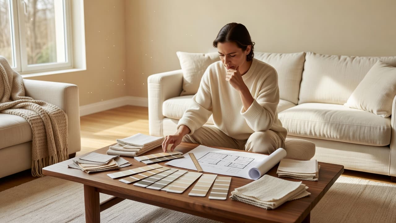
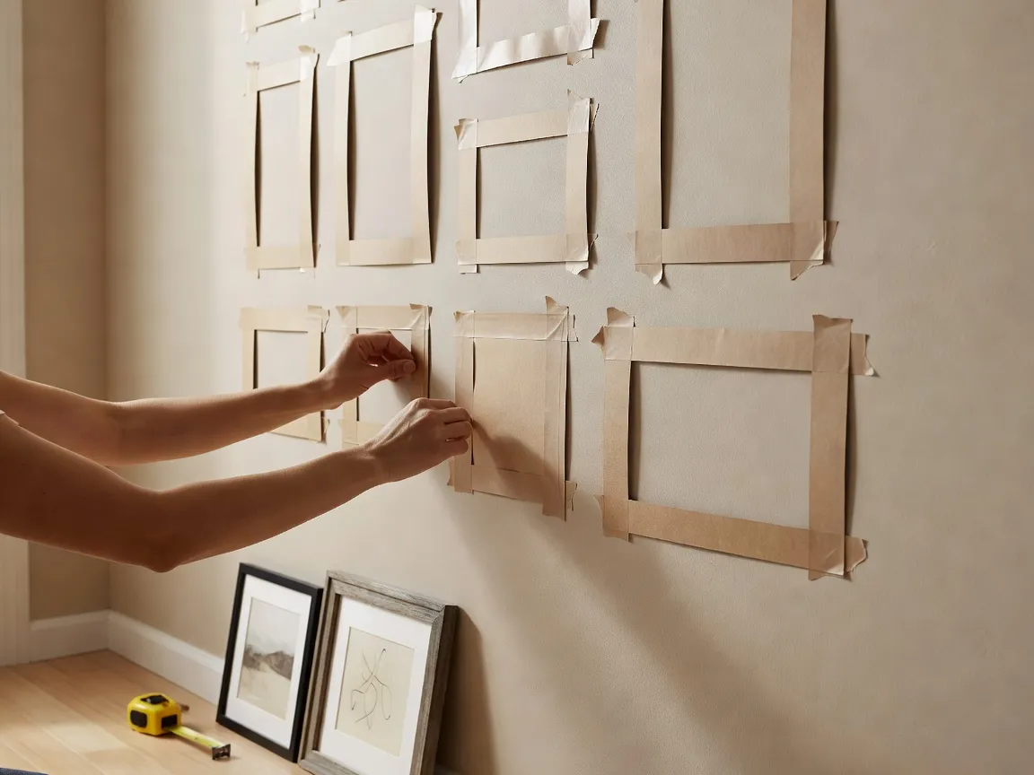
Whichever layout you choose, test it before drilling anything. The traditional method is cutting kraft paper to each frame's exact size, taping the templates to the wall, and stepping back to judge the arrangement — which works, but it's slow and doesn't show you color, finish, or how the art itself reads against your wall color. An AI gallery wall planner does the same job on a photo of your actual wall in seconds, and shows you the finished look rather than just paper outlines.
What Spacing and Sizing Rules Actually Work?
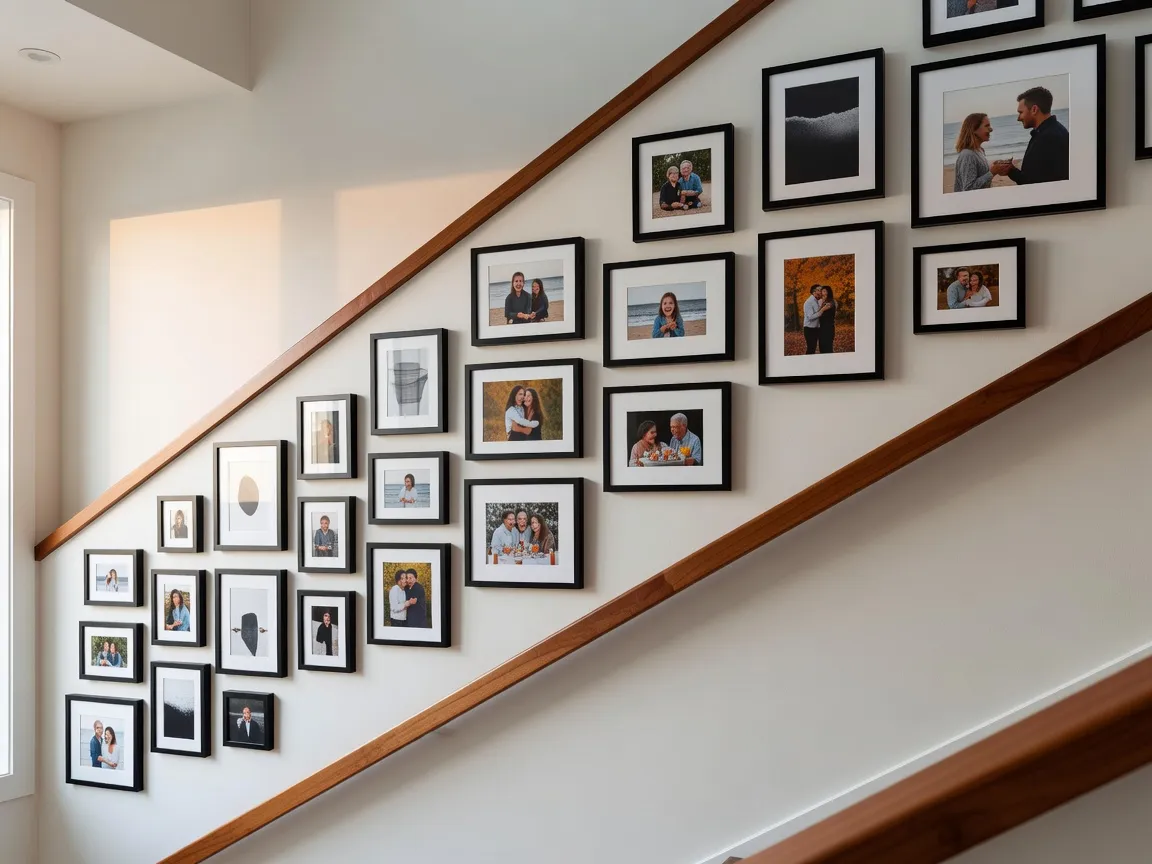
Spacing is the single biggest factor separating a gallery wall that looks designed from one that looks accidental. A consistent gap of 2 to 3 inches between frames is the standard that holds up across most layouts, whether it's a tight grid or a looser salon arrangement — the gap doesn't need to be exactly the same to the millimeter, but it needs to look consistent from a normal viewing distance. For a wall above furniture, keep the bottom edge of the lowest frames roughly 6 to 8 inches above the furniture — a sofa back, a console table, a stair handrail — so the arrangement reads as connected to the piece below it rather than floating separately on the wall. Center the overall arrangement on the furniture it sits above, not on the wall itself, since walls are rarely centered in a room the way furniture is, and a wall-centered layout can look oddly placed relative to the sofa beneath it.
Plan Your Gallery Wall — Free
Stop guessing how a frame layout will look once it's on the wall. Upload a photo of your actual space to DecorAI and preview spacing, frame sizes, and arrangement before you pick up a hammer.


How Do You Match Frames and Art to Your Room's Style?
Frame finish is one of the fastest ways to make a mismatched collection of art feel cohesive, even when the actual artwork varies widely in subject and color. Sticking to one or two frame finishes — all black, or black paired with natural wood — across an otherwise eclectic mix of prints, photos, and art does more for a unified look than matching every piece of art to the same color palette. Composition principles borrowed from classic visual art still apply at wall scale; the rule of thirds is a useful starting point for deciding where a larger anchor piece should sit within the overall arrangement rather than dead-centering it. If your room already leans toward a specific style, our AI maximalist interior design guide covers building a denser, more layered gallery wall that fits a bold room, while a quieter space benefits from the restraint covered in our AI minimalist interior design guide. Getting the wall color right underneath the arrangement matters too — our AI color palette for room design guide covers choosing a backdrop that lets the frames stand out rather than compete with the wall. Picture frames themselves have a long design history worth a quick look if you're deciding between ornate and simple profiles for the first time.
What Mistakes Do People Make Planning a Gallery Wall?
- Hanging everything too high. Art hung at general eye level for a standing adult in the room, roughly 57 to 60 inches to the center of the arrangement, reads as intentional; art hung near the ceiling reads as an afterthought.
- Inconsistent spacing. Gaps that visibly vary from one pair of frames to the next are the fastest way to make an otherwise good layout look sloppy.
- Ignoring the furniture below. A gallery wall that isn't centered on the sofa, console, or headboard beneath it looks disconnected from the room, even if the frames themselves are well chosen.
- Mixing too many frame finishes at once. Three or more different metals and woods in the same arrangement usually reads as unplanned rather than eclectic.
- Skipping the test phase entirely. Hanging frames one at a time and adjusting as you go leaves a wall full of extra nail holes; testing a full layout first, on paper or with AI, avoids that entirely.
AI Gallery Wall Planner — FAQ
How many frames does a gallery wall need?
There's no fixed minimum, but most gallery walls that read as intentional use at least 5 to 7 pieces; fewer than that usually looks more like a small cluster than a gallery wall, unless the pieces are unusually large.
What's the best spacing between frames on a gallery wall?
A consistent 2 to 3 inch gap between frames is the standard that works across most layouts, from tight grids to looser salon-style arrangements — consistency matters more than the exact measurement.
Can I mix frame colors in one gallery wall?
Yes, but limit it to one or two finishes — typically black plus natural wood, or black plus a single metal tone — since three or more mixed finishes tends to read as unplanned rather than deliberately eclectic.
Can AI show me how a gallery wall would look before I hang it?
Yes — uploading a photo of your actual wall to an AI design tool lets you preview frame count, sizing, spacing, and finish directly on your real space at true scale, which is far more useful for planning than a paper template or a saved inspiration photo alone.
Should a gallery wall be centered on the wall or the furniture?
Center it on the furniture beneath it — a sofa, console, or headboard — rather than the wall itself, since most walls aren't perfectly centered in a room and a wall-centered layout can end up looking oddly placed relative to what's sitting below it.
Conclusion
A gallery wall is worth planning against your actual wall and furniture rather than a template grid pulled from somewhere else, since spacing, scale, and frame color all read differently once they're up in your specific room with your specific light. Preview a grid or salon-style layout on a photo of your own wall first, and the decision between them becomes far easier. DecorAI lets you see exactly how a gallery wall layout will look in your real space before you hang anything. Explore the styles gallery for more design directions, read our AI mood board creator guide for collecting art and layout ideas in one place, or start from the DecorAI homepage to try it on your own space.
Visualize Your Dream Home Instantly
Don't just read about it. Experience the power of AI interior design with DecorAI's free tool.
Start Designing for FreeWritten by
DecorAI Team
Editorial Team