Choosing the Perfect Color Palette for Your Room with AI
Struggling with paint colors? AI helps you choose the perfect color palette for any room. Explore color psychology, harmonious schemes, and see results instantly before painting.

Choosing paint colors might be one of the most anxiety-inducing parts of home design. You buy samples, paint swatches on your walls, live with them for days, and still second-guess yourself. What if there was a better way to visualize room color palettes before committing to a single gallon of paint?
That's where AI color palette generators come in. These tools let you test unlimited color combinations in your actual space instantly—no tape, no brushes, no buyer's remorse. Let's explore how AI makes color selection easier and how understanding color psychology can transform your home.
Why Color Choice Matters More Than You Think
Color isn't just about aesthetics—it fundamentally affects how you feel in a space. A poorly chosen paint color can make rooms feel cramped, cold, or chaotic. The right palette creates harmony, influences mood, and even affects perceived room size.
Traditional interior designers spend years studying color theory: understanding hue, saturation, value, temperature, and how colors interact. Most homeowners don't have that expertise, which is why AI interior design tools with built-in color intelligence are revolutionary.
The Psychology of Room Colors
Different colors trigger different emotional responses. Here's what research shows about popular interior paint colors:
- Blue tones: Calming, promotes relaxation and focus—ideal for bedrooms and home offices
- Green hues: Refreshing and balanced, connects to nature—perfect for living spaces and bathrooms
- Warm neutrals (beige, tan, cream): Inviting and versatile, creates cozy atmospheres
- Cool grays: Modern and sophisticated, pairs well with accent colors
- Warm whites: Clean and spacious, reflects light beautifully
- Earth tones (terracotta, ochre, clay): Grounding and organic, trending in 2025
An AI room design tool takes this psychology into account, suggesting palettes that match both your aesthetic preferences and the room's function.
Understanding Color Harmony (Without the Art Degree)
Professional designers use the color wheel to create harmonious color schemes. AI tools automate this process, but understanding the basics helps you make informed choices:
Monochromatic Schemes
Uses different shades, tints, and tones of a single color. Think: navy walls with sky blue accents and cream trim. This creates a cohesive, sophisticated look that's nearly impossible to mess up.
Best for: Minimalist spaces, bedrooms, bathrooms where you want calm continuity.
Analogous Color Combinations
Uses colors that sit next to each other on the color wheel—like blue, blue-green, and green. Creates gentle transitions and natural harmony.
Best for: Living rooms, nurseries, spaces where you want visual interest without high contrast.
Complementary Palettes
Pairs colors opposite on the wheel—like blue and orange, or purple and yellow. High contrast creates energy and visual pop.
Best for: Dining rooms, creative spaces, accent walls (use sparingly—too much contrast can feel overwhelming).
Triadic Schemes
Uses three colors equally spaced on the wheel—like red, yellow, and blue. Bold and balanced when done right.
Best for: Playrooms, creative studios, eclectic styles (requires confidence to pull off).
The beauty of using an AI paint visualizer is that you can test all these schemes in seconds without needing to memorize color theory.
How AI Simplifies Color Palette Selection
Traditional color selection involves:
- Buying paint samples ($5-10 each)
- Painting large swatches on walls
- Living with them for several days
- Observing in different lighting
- Repeating if you don't love it
This process costs time and money. AI color palette tools streamline everything:
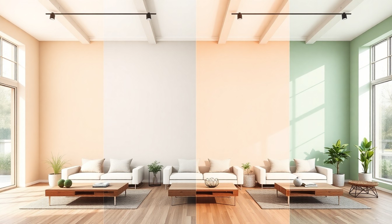
Upload Your Space Photo
Take a photo of your room in natural daylight. The AI analyzes your space's existing elements—flooring, furniture, natural light, room size—and factors these into color recommendations.
Instant Color Application
The AI applies different paint colors to your walls in real time, maintaining accurate lighting, shadows, and texture. You see exactly how "Agreeable Gray" or "Naval" looks in your specific room—not a generic stock photo.
Test Multiple Palettes
Try warm neutrals, cool grays, bold accent walls, two-tone combinations—all without lifting a brush. Compare palettes side-by-side to see which resonates.
Account for Lighting Changes
Advanced AI interior design tools can simulate how colors shift from morning to evening light, helping you avoid the classic mistake of choosing a color that looks perfect at 2 PM but awful at 8 AM.
Test Unlimited Color Palettes Free
See how any paint color looks in your room before you buy a single can. Upload a photo and start experimenting with color combinations instantly.
Choosing Colors by Room Type
Different rooms serve different purposes, so their color palettes should reflect their function.
Living Room Color Ideas
Your living room is where you entertain and relax, so colors should feel welcoming without being too stimulating.
- Warm neutrals: Accessible Beige, Kilim Beige, Shaker Beige create inviting spaces
- Soft grays: Repose Gray, Agreeable Gray, Edgecomb Gray offer modern elegance
- Muted blues: Quiet Moments, Sea Salt add calm sophistication
- Greiges (gray-beige hybrids): Balanced Beige, Revere Pewter provide versatile backdrops
Use AI living room design tools to test accent wall colors—navy, sage green, or terracotta can add personality without overwhelming.
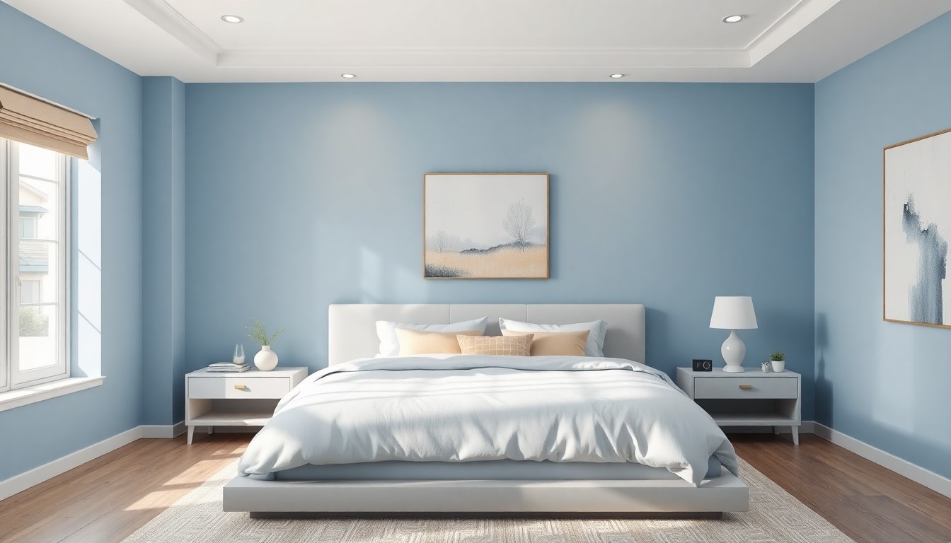
Bedroom Paint Color Psychology
Bedrooms should promote rest and relaxation. Avoid highly saturated or energizing colors.
- Soft blues: Breath of Fresh Air, Rainwash encourage sleep
- Gentle greens: Saybrook Sage, Clary Sage bring nature indoors
- Warm whites: Swiss Coffee, Alabaster create serene, airy spaces
- Muted lavenders: Silver Strand, Potentially Purple add subtle color
Test these with AI bedroom design visualization to see how they interact with your bedding and furniture.
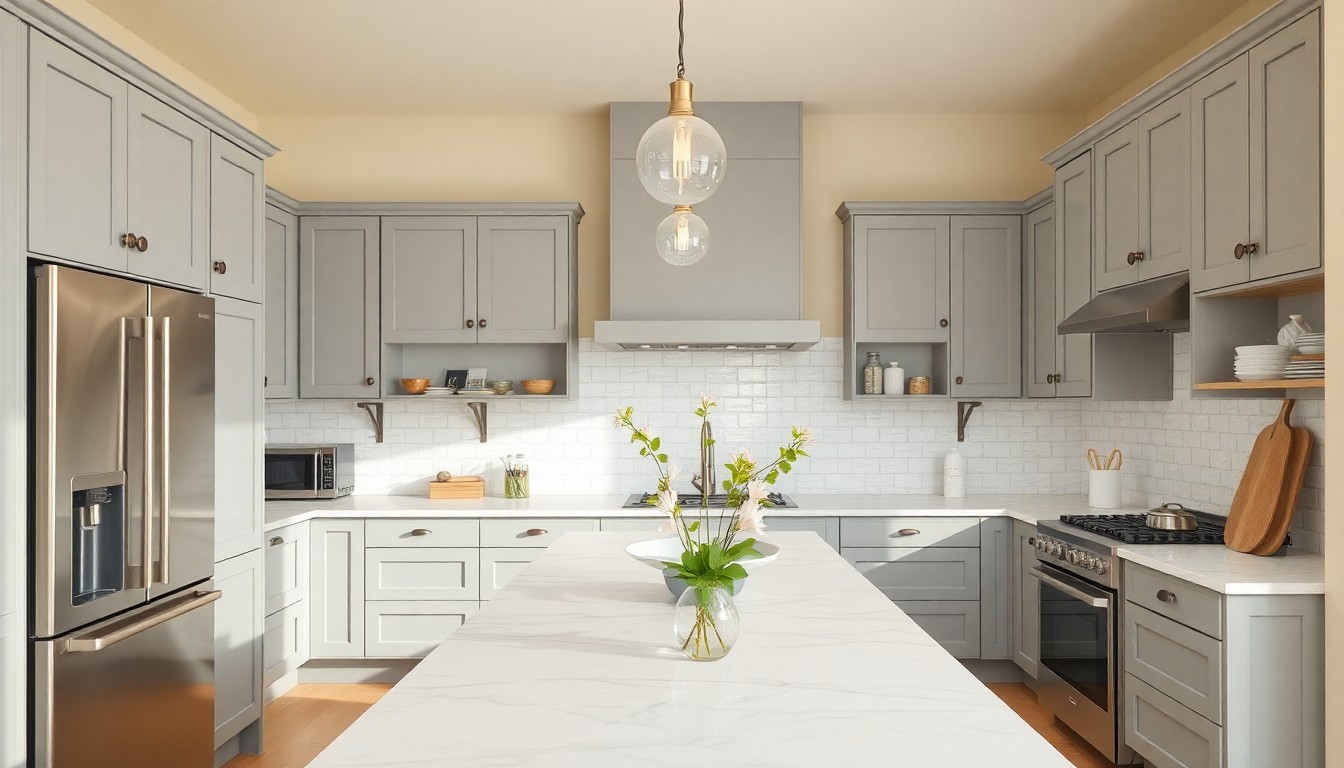
Kitchen Color Schemes
Kitchens benefit from colors that feel clean and energizing without being harsh.
- Crisp whites: Pure White, Chantilly Lace maximize brightness
- Soft grays: Gray Owl, Classic Gray complement stainless appliances
- Warm creams: Navajo White, Soft Chamois feel inviting
- Accent colors: Navy on islands, sage on cabinets add personality
Bathroom Color Palettes
Bathrooms can handle more color play, especially powder rooms.
- Spa-like blues/greens: Sea Salt, Rainwashed create tranquil vibes
- Crisp whites: Decorator's White keeps things fresh
- Bold choices: Deep navy (Hale Navy), charcoal (Kendall Charcoal) make statements
Common Color Selection Mistakes (And How AI Prevents Them)
Mistake 1: Ignoring Undertones
Paint colors have subtle undertones—pink, green, blue, yellow—that become obvious once on the wall. A "gray" with pink undertones can look mauve in certain light.
AI solution: Color visualizers show how undertones interact with your specific lighting and existing furnishings.
Mistake 2: Choosing Colors in Isolation
That perfect navy swatch might clash with your brown sofa or make your oak floors look orange.
AI solution: AI applies colors in context, showing interactions with floors, furniture, and architectural elements.
Mistake 3: Forgetting the Ceiling
Most people default to white ceilings, but painted ceilings can add drama. Dark ceilings create coziness; colored ceilings add unexpected charm.
AI solution: Test ceiling colors along with walls to see the full effect.
Mistake 4: Too Many Colors
Using different colors in every room creates visual chaos. Homes feel more cohesive with a limited palette (3-5 colors total) used throughout.
AI solution: Generate whole-home color schemes that flow from room to room.
Advanced Color Tips for Bold Designers
The 60-30-10 Rule
Professional designers use this proportion:
- 60%: Dominant color (usually walls)
- 30%: Secondary color (furniture, curtains)
- 10%: Accent color (pillows, art, accessories)
This creates visual balance. AI tools can show you how this rule works with your chosen palette.
Using Warm vs Cool Tones
Warm colors (reds, oranges, yellows, warm neutrals) advance visually—they make walls feel closer, creating intimacy. Great for large rooms or north-facing spaces lacking warmth.
Cool colors (blues, greens, cool grays) recede visually—they make walls feel farther away, creating spaciousness. Perfect for small rooms or south-facing spaces with abundant light.
Accent Walls Done Right
Accent walls work best on architectural focal points—fireplace walls, bed walls, interesting angles. The accent color should appear elsewhere in the room (pillows, art) for cohesion.
Test accent wall colors with AI design tools to avoid the common mistake of making the wall too bold or isolated from the room's palette.
Creating Flow Between Rooms
Colors in adjacent rooms should relate. You don't need identical colors, but they should share undertones or exist on the same temperature spectrum (all warm or all cool).
Use AI to visualize color transitions from room to room, ensuring your home feels intentional rather than haphazard.
From AI Visualization to Real Paint
Once you've found your perfect color palette using AI, here's how to translate it to reality:
- Verify in multiple lighting: View your AI-generated palette at different times of day if possible
- Order sample pots: Most paint brands offer small sample sizes ($5-10)
- Paint large swatches: 2x2 foot sections in different areas and lighting conditions
- Live with it: Observe for 2-3 days—colors shift as your eyes adjust
- Commit with confidence: Having pre-visualized with AI means less second-guessing
Many AI interior design apps can even suggest specific paint brand matches (Sherwin-Williams, Benjamin Moore, Behr) for the colors you've chosen.
2025 Color Palette Trends
If you're looking for on-trend inspiration, here's what's popular in 2025:
- Warm minimalism: Cream, oat, warm white with natural wood tones
- Earth tones: Terracotta, clay, ochre, rust paired with sage and olive greens
- Quiet luxury neutrals: Mushroom, taupe, greige, warm concrete
- Moody maximalism: Deep navy, forest green, burgundy with metallic accents
- Soft pastels: Dusty pink, powder blue, sage green for a gentle, organic feel
Test these trends in your space with AI trend visualization tools before committing.
Expert Color Resources
For deeper color theory knowledge, check these authoritative sources:
- Architectural Digest's Guide to Bedroom Colors - Expert recommendations from professional designers
- Psychology Today: Color Psychology in Home Design - Science-backed insights on color and mood
- Better Homes & Gardens Color Guide - Comprehensive color selection advice
Combine expert knowledge with AI visualization for the best results.
Color selection doesn't have to be overwhelming. With AI color palette tools, you can test unlimited combinations, understand color psychology, and see exactly how paint colors look in your space—all before buying a single sample.
Whether you're going for warm minimalism, moody maximalism, or timeless neutrals, AI takes the guesswork out of one of design's trickiest decisions. Upload a photo, experiment with palettes, and find colors that make your space feel like home.
Find Your Perfect
Color Palette
Test unlimited paint colors in your actual room. See how every shade looks before you paint.
Visualize Your Dream Home Instantly
Don't just read about it. Experience the power of AI interior design with DecorAI's free tool.
Start Designing for FreeWritten by
DecorAI Team
Editorial Team