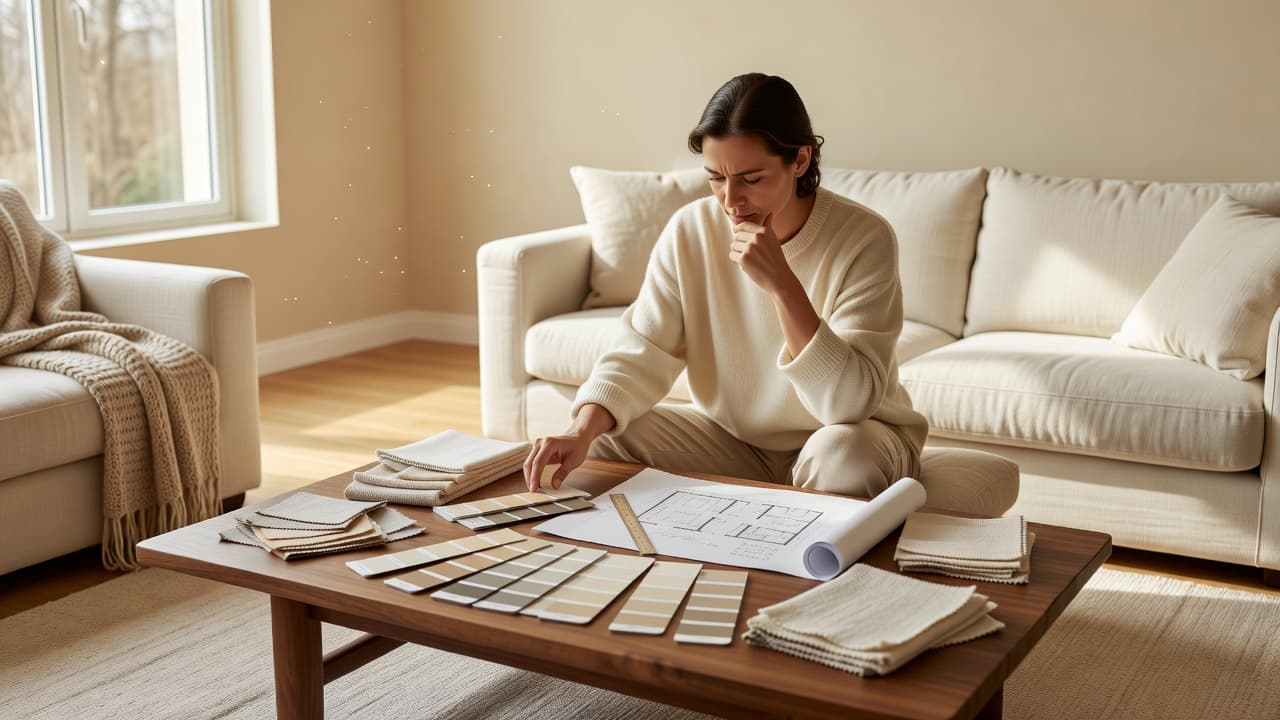
AI Backsplash Visualizer App: Preview Kitchen Tile Before You Buy
A complete guide to using an AI backsplash visualizer app to preview subway, herringbone, and patterned tile directly on a photo of your real kitchen wall before you order samples or commit to a layout — how the technology works, matching tile to your countertop and cabinets, choosing a pattern and grout color, and the most common backsplash mistakes.
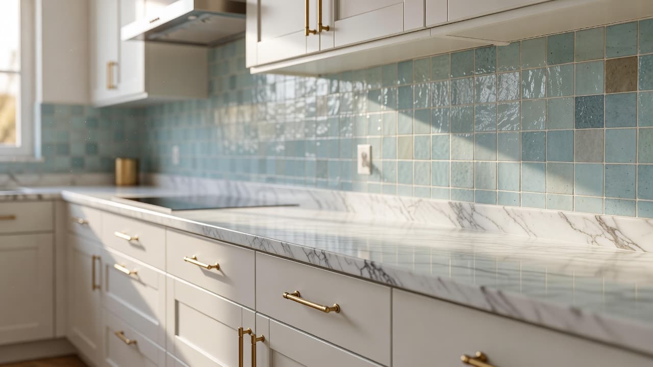
An AI backsplash visualizer app lets you upload a photo of your actual kitchen wall and preview a new tile pattern, color, and grout line rendered at true scale between your real countertop and cabinets, before you order a single sample or commit to a layout. A backsplash is one of the smallest surfaces in a kitchen by area, yet it's one of the hardest finishes to picture from a tile store's 12-inch sample board, because the way a pattern repeats, the way grout color reads at scale, and the way a tile's undertone sits against your specific counter and cabinet colors are almost impossible to judge from a swatch alone. With DecorAI, you can test a classic subway layout against a herringbone pattern on the same wall, compare white grout to a charcoal contrast line, or see how a bold patterned tile would actually read next to your existing cabinets, all on a photo of your real kitchen. This guide covers how AI backsplash visualization works, matching tile to your countertop and cabinets, choosing a pattern and grout color that will hold up over time, and the most common backsplash mistakes people make when they design from a sample board instead of their actual wall.
Key Takeaways
- A tile sample board is a poor stand-in for a full wall — pattern repeat, grout density, and undertone all read differently once a tile covers 20+ square feet instead of a 12-inch board.
- AI visualization uses your real kitchen — a photo of your actual counter, cabinets, and wall produces a far more useful preview than a showroom display under different lighting.
- Grout color changes a tile's entire look — the same white subway tile can read crisp and modern or soft and traditional depending only on the grout line.
- Match the backsplash to your counter and cabinets, not to the tile alone — undertone conflicts between countertop and tile are the single most common backsplash regret.
- AI lets you compare pattern, color, and grout on your actual kitchen wall before you order tile that's expensive and time-consuming to return or re-lay.
What Is an AI Backsplash Visualizer App, and How Does It Work?
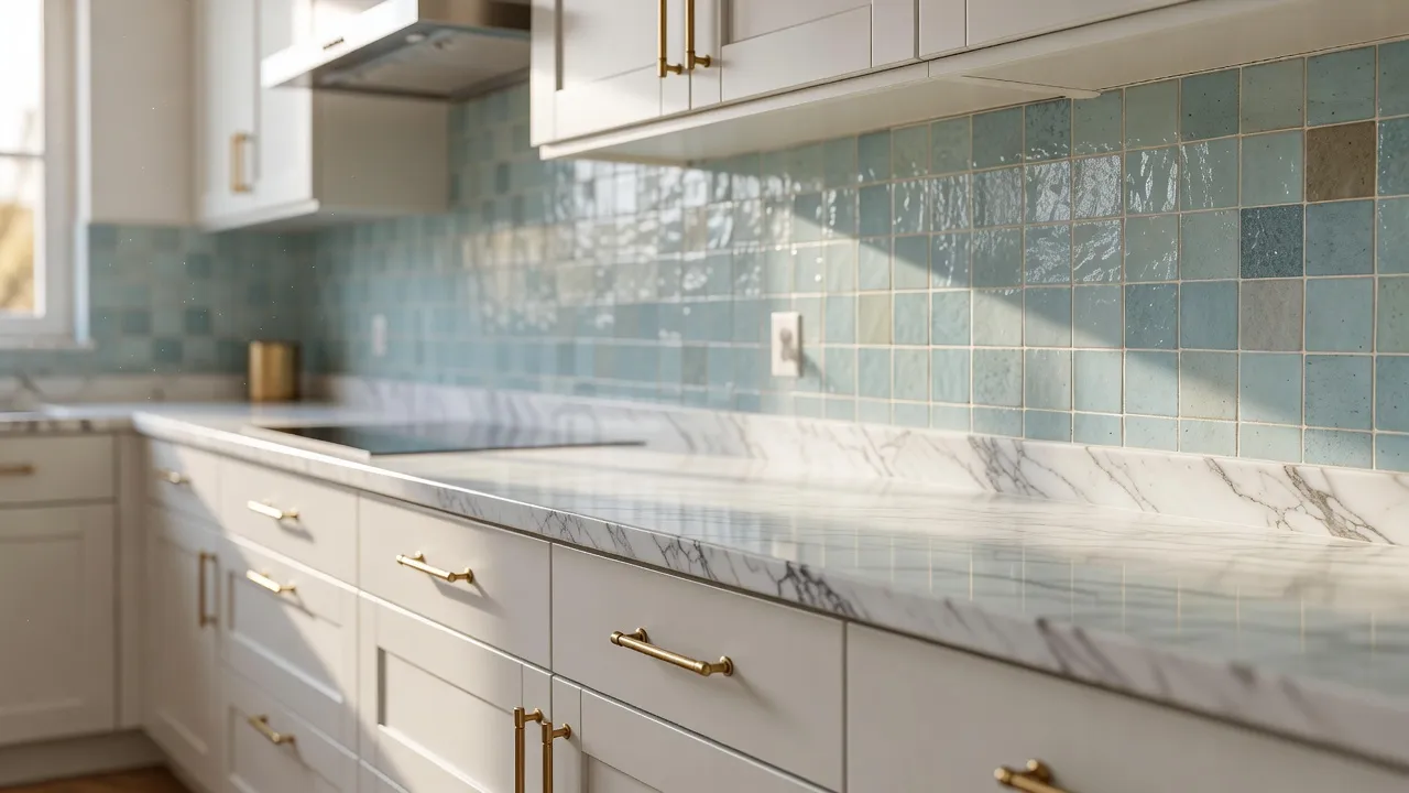
An AI backsplash visualizer app works from a photo of your actual kitchen wall and generates a photorealistic version of that same wall with a new tile pattern, color, and grout line applied at true scale — sized and positioned the way it would actually sit between your real countertop, cabinets, and outlets. This matters more for a backsplash than for almost any other tile surface in the house, because a backsplash is bounded on nearly every side by fixed elements you can't change: the counter below it, the cabinets above and beside it, and the wall outlets and range hood cutting through it. A pattern that looks balanced on an open sample board can look completely different once it's interrupted by those same fixed points, which is exactly what a photo-based preview shows you before you buy.
How Do You Choose a Backsplash Tile Step by Step?
Choosing a backsplash well comes down to matching the tile to what's already fixed in the room, picking a layout pattern that suits your wall's proportions, and settling on a grout color before you order rather than after.
Start From Your Countertop and Cabinets, Not the Tile
The backsplash is the one surface in a kitchen that's easiest to change later, which is exactly why it should be chosen last, against the counter and cabinet colors you already have or have already committed to. A cool white marble-look counter next to warm wood cabinets calls for a tile that bridges the two undertones rather than pushing further toward one side, while an all-white kitchen has far more room to introduce color or pattern in the backsplash without fighting anything else in the room. Pulling a small piece of your actual countertop material, or a photo of it in your kitchen's real light, is a far more reliable way to judge a tile's undertone than comparing it to a counter sample under store lighting.
Choosing a Layout Pattern for Your Wall
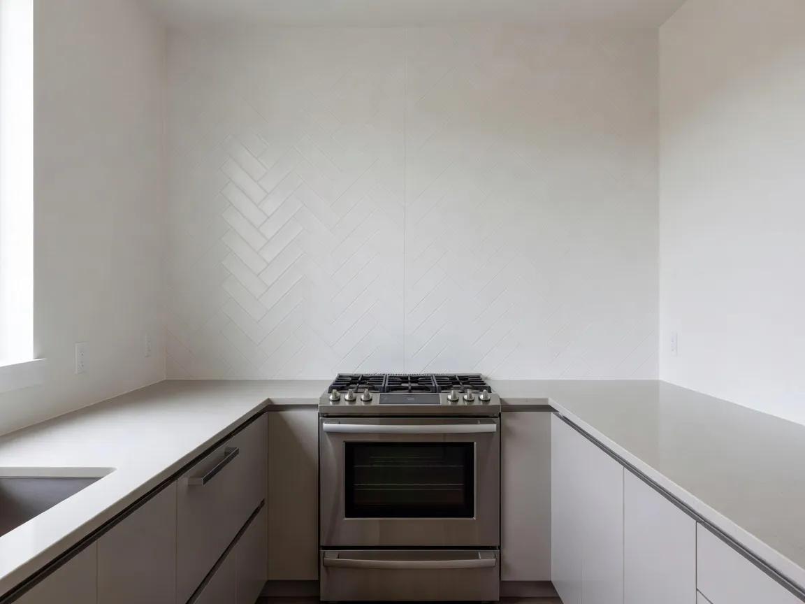
A straight-stack subway layout is the most forgiving pattern for an oddly proportioned wall or a busy stretch full of outlets, because its repeat is simple and it doesn't draw extra attention to interruptions. A 1/3 offset or herringbone pattern reads more intentional and higher-end, but both need a reasonably clean, uninterrupted run of wall to look right — herringbone in particular can look chaotic if it's forced to jog around a window or a narrow strip between cabinets. Wider format tile, in the 3-by-12-inch or 4-by-16-inch range, generally suits a longer, uninterrupted wall run behind a range, while classic 3-by-6-inch subway tile scales better to a shorter, more broken-up stretch of wall between upper cabinets.
Picking Grout Before You Order Tile, Not After
Grout color is not a finishing detail — it's a design decision that changes how the entire tile reads, and it's worth deciding before tile arrives rather than defaulting to whatever the installer has on hand. A white subway tile with white or light gray grout nearly disappears into a soft, seamless wall, while the same tile with a charcoal or black grout line turns into a strong graphic grid pattern; neither is wrong, but they're two different design choices that should be made on purpose. Grout also gets meaningfully harder to change than tile itself once it's installed, so it's worth testing a couple of grout tones against your actual tile and wall before committing.
Preview Your Backsplash — Free
Stop guessing how a tile pattern, color, or grout line will look on your actual kitchen wall. Upload a real photo to DecorAI and preview the redesign before you order samples or commit to tile.


Which Backsplash Patterns and Colors Actually Work Well Together?
The safest backsplash choices pair a simple layout with a bolder tile, or a simple tile with a bolder layout, rather than pushing both at once. A patterned or colored tile — encaustic-style, zellige-look, or a bold hue — reads best in a straightforward straight-stack or brick layout, because a complex pattern arrangement would compete with the tile itself for attention. Conversely, a plain white or neutral tile is the best candidate for an ambitious layout like herringbone or a vertical stack, since the interest comes entirely from the geometry rather than the tile's own color or texture. This same “one bold element, one quiet element” logic shows up throughout interior design, and it's covered in more general terms in our AI color palette for room design guide, which walks through testing color pairings against your room's real light before committing to any single finish.
How Do You Compare Tile Samples Without Wasting Money?
Ordering physical samples still matters for judging a tile's true finish and texture in person, but you can narrow the field dramatically before any samples arrive by testing candidates against a photo of your actual wall first. Laying two or three tile options side by side on a real photo of your kitchen, rather than comparing them to each other in isolation on a countertop, exposes undertone mismatches and pattern-scale problems immediately — a tile that looked neutral next to a competitor's sample can suddenly read too cool or too warm once it's actually sitting against your specific counter and cabinets. This is the same reasoning behind our broader AI flooring visualizer guide and our AI rug visualizer app guide: any finish that has to coexist with fixed elements already in the room benefits from being tested in that room, not in isolation.
What Mistakes Do People Make Choosing a Backsplash?
- Choosing tile in a showroom instead of against your own counter and cabinets. Showroom lighting and neighboring displays change how a tile's undertone reads; your kitchen's real light is what matters.
- Picking a complex layout for a wall full of outlets and cabinet interruptions. Herringbone and other high-pattern layouts need a clean run of wall to look intentional rather than chopped up.
- Leaving grout color as an afterthought. The same tile can look completely different depending on whether the grout blends in or contrasts — decide this before tile is ordered.
- Matching the backsplash to the floor instead of the counter. The counter sits directly against the backsplash and shares more visual space with it than the floor does; prioritize that relationship first.
- Skipping a full-wall preview and judging from a small sample alone. A 12-inch board can't show how a pattern repeats or how grout density reads across an entire wall.
AI Backsplash Visualizer — FAQ
Can AI show me a backsplash on my actual kitchen wall?
Yes — uploading a photo of your kitchen to an AI backsplash visualizer app lets you preview a tile pattern, color, and grout line rendered at true scale on your real wall, between your actual countertop and cabinets, rather than on a generic stock kitchen photo.
What's the easiest backsplash pattern to install and get right?
A straight-stack subway layout is the most forgiving choice for a wall with outlets or an uneven run of space, since its simple repeat doesn't draw attention to interruptions the way herringbone or a diagonal pattern would.
Should backsplash grout match the tile or contrast with it?
Either works, but they create very different looks: matching or light grout makes a tile read as one seamless surface, while contrasting grout turns the same tile into a visible grid pattern — decide intentionally rather than defaulting to whatever's on hand.
Should I match my backsplash to my countertop or my cabinets?
Prioritize the countertop first, since it sits in direct, continuous contact with the backsplash and shares the most visual space with it, then check that the result also works with your cabinet color rather than treating all three as equally weighted decisions.
How many backsplash tile samples should I order before deciding?
Narrow the field to two or three finalists using a photo-based preview against your actual kitchen wall first, then order physical samples only of those finalists to confirm texture and true color in person before buying full tile.
Conclusion
A backsplash covers a small footprint, but it sits directly between two of the most expensive and hardest-to-change surfaces in a kitchen, which is exactly why it's worth previewing before you commit. Testing a pattern, color, and grout line on a photo of your real wall — rather than judging from a small sample board — catches undertone mismatches and layout problems while they're still free to fix. DecorAI lets you see exactly how a backsplash redesign will look against your real counter and cabinets before you order tile. Explore the styles gallery for more design directions, read our AI kitchen remodel guide for a full-room approach, or start from the DecorAI homepage to try it on your own kitchen.
Visualize Your Dream Home Instantly
Don't just read about it. Experience the power of AI interior design with DecorAI's free tool.
Start Designing for FreeWritten by
DecorAI Team
Editorial Team